
Gmail Meter: Hacked (and We Couldn't Be Happier)

Below is a guest post by Rik Van Bruggen, Regional Director of Neo Technology. Among other things, Rik is a data-mining and spreadsheet expert. He recently donated some of his time to transform Gmail Meter statistics into incredible social graphs. Enjoy.
First, some background. I work for a VERY cool company. We develop, market, sell and support one of the best things since sliced bread: Neo4j, the leading open source graph database.
What on earth is that? Well, it’s basically a new way of looking at lots of highly interconnected “network-” or “graph-” centric data structures. It’s part of the “Not Only SQL” movement that says that you should be using the right tool for the job, and not try to cram every data problem that you may have into a relational database. Graph databases store data in a “property graph," made up of nodes, relationships and properties.
So what, you ask? How does that connect to email analysis or Gmail Meter? Well, let me explain.
A bunch of different people have pointed out to me in recent months that there is something funny about Graphs and email analysis. From my work in previous years at security companies, I know that Email Forensics is actually big business. Figuring out who emails whom, about what topics, with what frequency, at what times - is important. Especially when the proverbial sh*t hits the fan and fraud comes to light - like in the Enron case. How do I get insight into email traffic? How do I know what was communicated to who? And how do I get that insight, without spending a true fortune?
So a couple of weeks ago I came across an article or two that featured Gmail Meter. This is of course not one of these powerful enterprise-ready forensics tools, but it is interesting. Written by Romain Vialard and Shuttlecloud, it provides you with a really straightforward way to get all kinds of stats and data about your use of Gmail.
In this blog post, we’ll take a look at how we can actually use Romain’s output, and generate a neo4j database that will allow us to visually and graphically explore the email traffic in our Gmail inboxes - without doing doing any coding.
Using Gmail Meter to create the dataset
The first thing you need to do to get going is to get Gmail Meter installed. Note: For this functionality I installed Gmail Meter manually, which involves searching through the Google Apps Script Gallery. If you’ve installed Gmail Meter via the website, you won't have access to this data.
After installing Gmail Meter, a Google Doc spreadsheet populates in your Google Drive folder. This spreadsheet has two tabs:
- Sheet1 - contains information about which email addresses you have been exchanging with, and how many emails you have been exchanging with them (sending and receiving)
- Sheet2 - contains more information about the conversations, number of words, etc.
Now all we need to do is create a neo4j database based on this data - and that's a piece of cake.
Importing the Gmail Meter data into Neo4j
For the graph import illustrated below, we will only be using the first sheet. Basically just getting to grips with
- the people that we are emailing to
- the people that we are receiving emails from
- the frequency that we are emailing to/from these contacts
There’s definitely more data here - but let’s start with this.

The way I have done it - which is probably not the only way to do it, but still - is to add two sheets to the workbook coming from Gmail Meter.
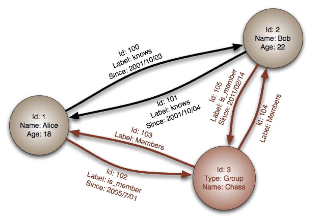
1. Graph: to convert the data from Gmail Meter’s first worksheet into nodes and relationships2. Cypher: to generate the Cypher query statements that we can use to generate the Neo4j database and start playing around.
I have shared the worksheet over here - take a look and customize it however you please. You should end up with something like this:

As mentioned above, this graph sheet includes an additional property "number of emails" to the “EMAIL” relationship. This comes in handy later when visualizing the email traffic. In a larger graph you could actually use these weights for path finding algorithms as well - in case you want to find out the volume of email traffic between two persons at different places in the graph, through other people.
You see that I am using the exact same techniques of my spreadsheet import blog post to generate the Cypher statements required. All I need to do after that is to put all statements into the Cypher worksheet, wrap it with a transaction, and paste that into the neo4j shell of my empty neo4j database. This will execute the queries, insert all nodes, relationships and properties, and voila - we have our Gmail Meter Graph!
Exploring the Gmail Meter Graph
Once we generate the database, we can explore all the features of Neo4j’s traditional visualisation/querying tools. For this I used Webadmin, our UI for browsing and manipulating data. Doing this provides some ideas already, but things get a lot more interesting when you can visualise the weights, such as the number of emails between two people.
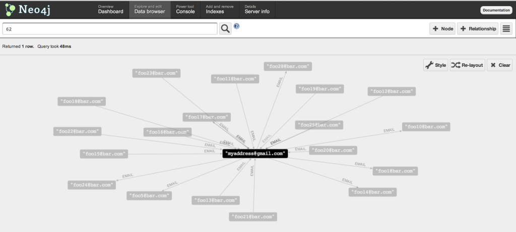
To do this, I plugged another visualisation tool on top of the database to get a feel for the weight of certain relationships. Our friends at Linkurio.us have some neat (and powerful and simple) ways to do this, and as you can see below, this immediately gave me an idea of how my message traffic is flowing.

We can also explore the network, query it with Cypher (the declarative Graph Query language that comes with Neo4j), and look for interesting relationships.
Of course, because we are looking at data from only one mailbox, the dataset’s power is quite limited. But I am hoping this proves a concept that graph exploration of a dataset is great. I did a little experiment where I actually put my professional email data and my personal email data (both use Gmail) into one neo4j database, and that was even more interesting. It showed overlaps between my professional and personal email traffic, and of course the differences as well.
For those of you wanting more detailed info on this topic, I encourage you to take a look at the Graph Databases book, which has a specific chapter about email analysis. You can also reach out to me at rik@neotechnology.com or @rvanbruggen.
I hope this was useful - it sure was a learning experience for me.